For your final project, design and build a one page website on a topic of your choosing. Use Datavisual, D3, and/or APIs. You may use your own data, open data sets or APIs as a source of data.
Please fill out the course evaluation. This is particularly import to learn how the shift to distance learning effected your educational experience.
Today we will be continuing our discussion about JavaScript and will specifically be focusing on the D3 library which was created for interactive and animated data driven graphics for the web.
1. Decide what you want to do for your final project. This can be an interactive version of your midterm, a website around your personal data or a creative way to use data from APIs. You have to use at least one interactive Datavisual chart, one API connection or one d3js visualization. Feel free to use more, or all, of these options if you so please. 2. Come to Slack class next week with your idea solidified and present a creative brief (1 paragraph) of what you plan to create and the data you will be working with for your final.
Today we will be using what we learned about JavaScript and jQuery to pull live data from other websites and databases using an API (Application Programming Interface). Pretty much every App or Website is pulling data from another service through an API. We will specifically focusing on APIs for Open Weather, Mapbox and Giphy.
1. Explore the world of APIs. Think of a website or topic that you are interested in and try and find an open API where you can pull that data into your own website. Build a small website that pulls live data from the API you found. 2. Start to think about what you want to build for your final project. This can be an interactive version of your midterm, a website around your personal data or a creative way to use data from APIs. 4. Share your API project on the Slack channel next time we meet. 3. Watch the videos and review the lecture slides for Week 11, come to class with questions next week.
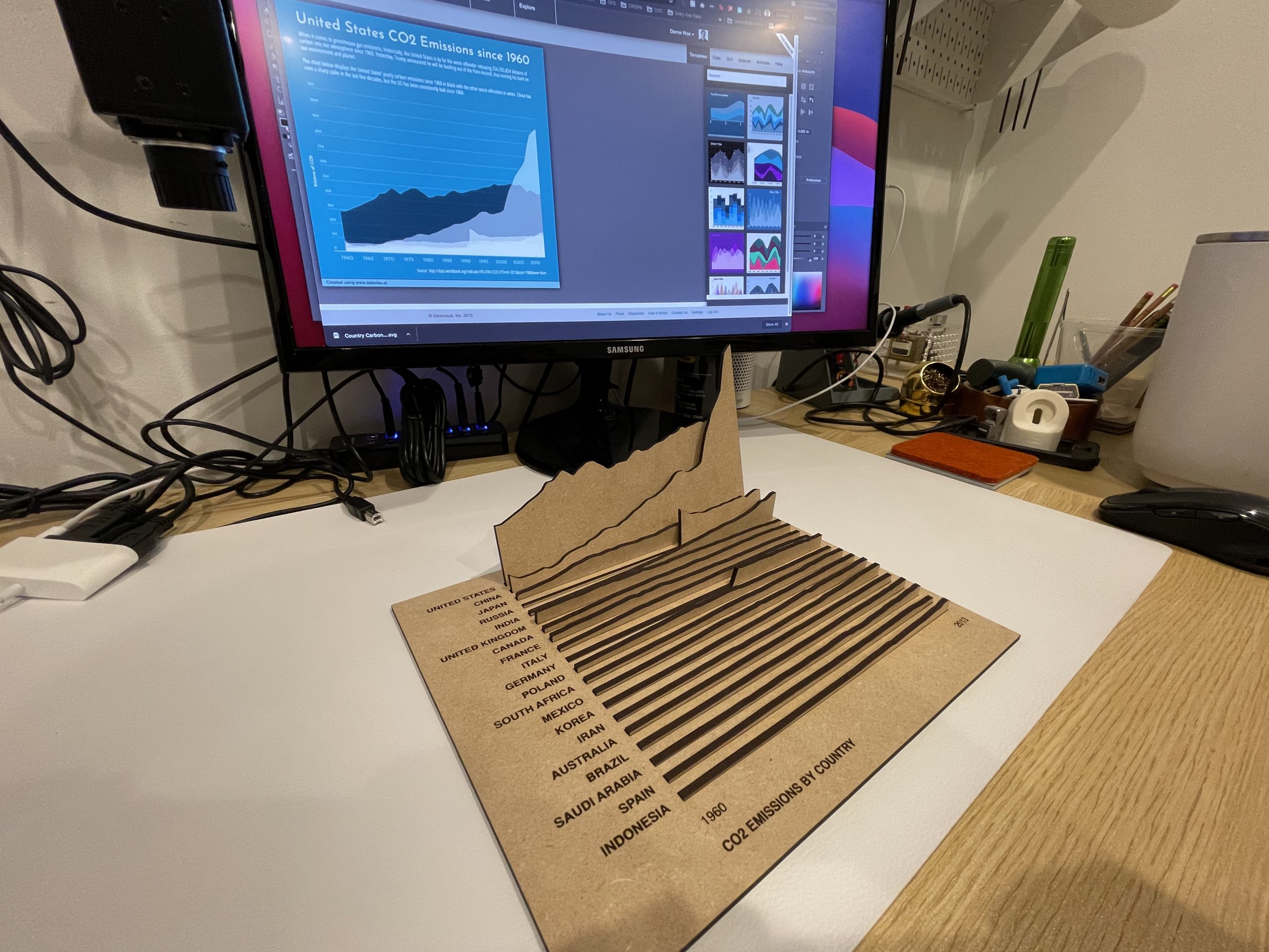
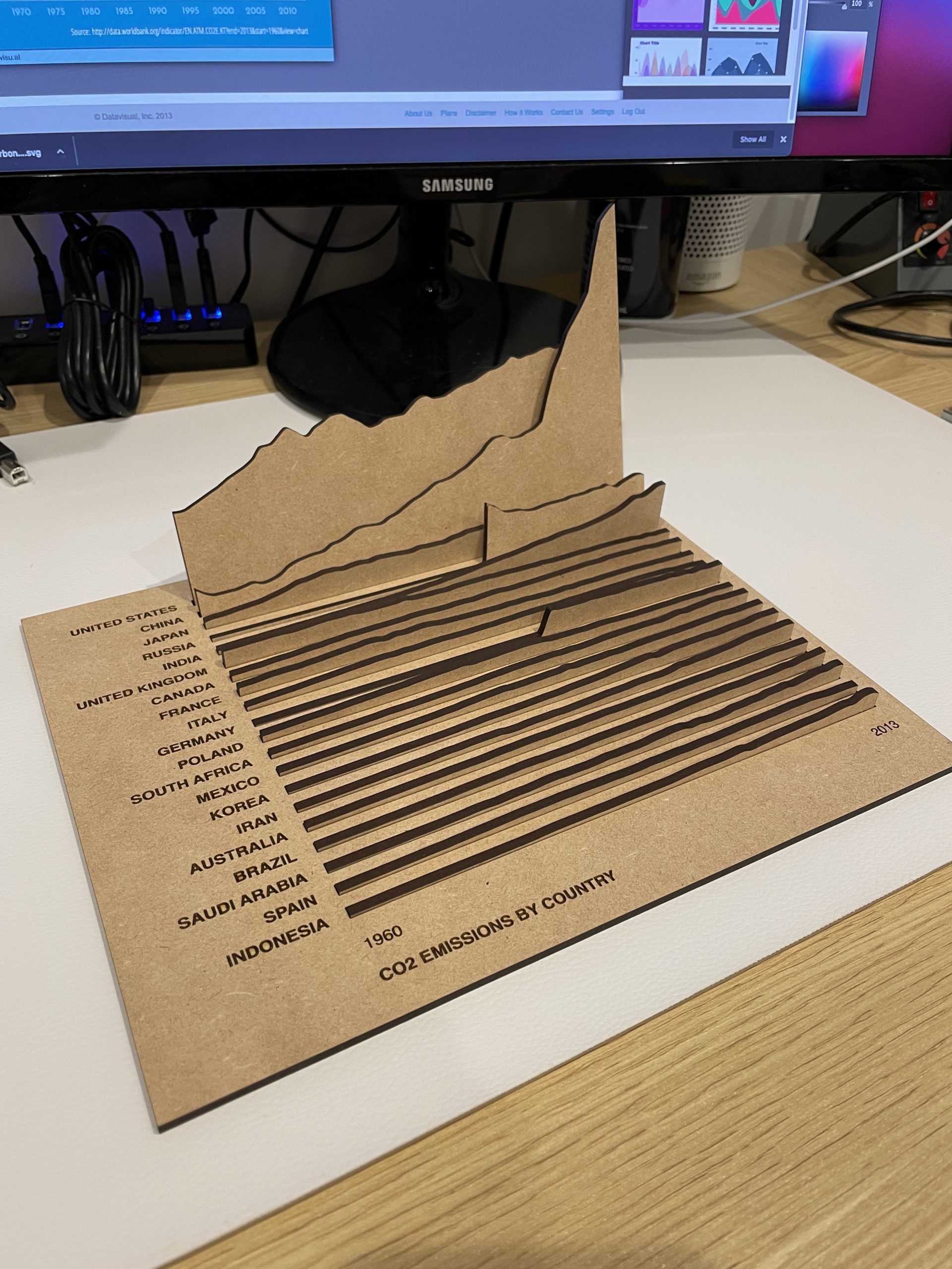
Alternative Physical Data Visualization Option
Lecture Video on Physical Visualizations using the 3D Printer
Homework
Using Illustrator create a design and export it as a SVG file. Upload the SVG file to Tinkercad and create a 3D version of it. Export the 3D version as a STL file and take it to the Makerspace to print it out on a 3D printer.
Today we will be talking about how to program for the web using JavaScript. We will be covering most of the same programming topics we discussed with Processing including: variables, arrays, loops, if statements, functions and objects. These topics are basically the same for JavaScript, just using slightly different words. We will also be talking about a JavaScript framework called jQuery that makes it much easier to write code in JavaScript.
1. Create a simple clock using JavaScript and jQuery. Once you have that try and do something creative with those values. Change the color of an HTML element, the size, location, etc. 2. Watch the videos and review the lecture slides for Week 10, come to class with questions next week.
Tips:
Create a function to display the time.
Use the Date object to get the current time.
Use setInterval(displayTimeFunction, 1000); this updates the function every second.
Lecture Video on Physical Visualizations using the Laser Cutter
Homework
Create a design in Illustrator, go to the Makerspace and laser cut and etch it on any material of your choosing. This does not have to be data driven it can be anything you want to laser cut and/or etch.
Today we will move from the desktop to the browser and discuss the reason for going to a digital environment when visualizing and interpreting data. We will talk first about the layout and design of the web using HTML (hypertext markup language) for content and CSS (cascading style sheets) for the style. We will also be covering using Datavisual for the web. We will be using glitch.com as a programming environment.
Guest Lecture Surya Mattu from The Markup talks about how he works with data for journalistic purposes.
In Class Assignment / Homework
1. Create a simple webpage using HTML and CSS. The content of the webpage should be information about you, think of it as an about page. Please include at least one interactive Datavisual chart into this webpage. Be prepared to share the live app link (share (top left) > live app) in the Slack channel next class to share your creations with the rest of the class. 2. Watch the videos and go through the lecture slides for Week 9.
Create an infographic for our midterm presentations this week. You must use the Illustrator graphing tool and/or Datavisual and/or Processing to create any data driven graphics (charts and graphs). Please design the over all layout to reflect the overarching theme. I would suggest using either InDesign or Illustrator for the overall layout. Export a PDF of your poster design and be prepared to present it on Slack this week.
Homework
Read through the lecture slides for Week 8 and watch the video tutorials on the Week 8 page. This should be a review for you of HTML and CSS and will cover how to embed a Datavisual chart onto your website. Come to the Slack chat next week with any questions.
Guest Speaker Mark Schifferli of Fathom Design talks about the work that Fathom does with data visualization and building data run platforms. Watch video below.
Today we will be discussing the difference between data visualization and an infographic. We will also be talking about how design can help the infographic and when it can just turn into “chartjunk” and distract the user from understanding the data.
When it really comes down to it data visualization is all about clearly telling the data’s story. Because there are so many interesting data points available to us now, journalists are using this data as facts supporting their story. Today we will talk about how multiple data points can work together to help support an over arching story.
We will also be talking about the data visualization software I created called Datavisual. This tool makes it easy to design charts, graphs and maps for both print and web applications. We will be talking about how to create a bar chart, pie chart, choropleth map, centroid map and geo location map; how to upload data and export a PNG image, vector SVG and PDF as well as a interactive web-embed.
Reading: Chapter “The Complexity Challenge: Presentation and Exploration”, pages 73-86
Continue working on your infographic. When complete save it as a PDF for our midterm presentations in two weeks. You must use either (or both) the Illustrator graphing tool or Datavisual to create any data driven graphics (charts, graphs and maps). Please design the over all layout to reflect the overarching theme, think about color, iconography, typography to support your designs. I would suggest using either InDesign or Illustrator for the overall layout. It must be at least 20″ x 30″ and exported as a PDF to be shared and presented on our Slack channel during week 7.
Guest Speaker Jer Thorp, artist, designer, writer and teacher, talks about his work with data as a medium for creating art. Watch video below.
The way we see and comprehend our surroundings is extremely important to understand when visualizing information. First and foremost you want the visualization to be clear and easily understood. Mostly, everyone on this planet is born to understand this world through our sight. Thats why it is so important to interpret any dataset visually, it would take a much longer time to gain any insight staring at a spreadsheet or trying to calculate a mathematical equation. Today we will be talking about this need to understand how we see and comprehend and how we can use this knowledge to become better information designers.
We will also learn how to use Adobe Illustrator to help us visual interrupt these numerical values.
Take one of the data sets you have been playing with the last few weeks and use Adobe Illustrator’s Graphing Tool to design a simple chart. Make sure you use the right chart type for the data set you will be visualizing.
Homework
Reading: Chapter “Creating Information Graphics”, pages 153-171 and “The Rise of Interactive Graphics”, pages 185-204
1. Find a successful data driven design (chart, graph, map, infographic) to share with the class that you find interesting, beautiful and/or easy to understand. This can be a static visualization, interactive, motion graphic, photographic, wayfinding, etc. 2. Find a chart, graph, map or other data visualization that is NOT successful to share with the class. 3. Continue your research and collecting data on the topic you chose to focus on for your midterm. Start sketching out your poster design to determine the layout and the type of content you will be using to create your 20″ x 30″ poster. Think about the hierarchy of your content and the story you are trying to tell with the data. Do you want to want to call out any data specific points in your design? Include headers, subheaders and captions to make your design as easy to digest as possible. Make sure you save where you found your data to include a source text footnote. 4. Watch the lecture video for Week 5.
Guest Speaker Amber Thomas, Data Journalist, Storyteller and Programmer at The Pudding and Data.World. Watch videos below.
Fall 2021
Spring 2021
Today we will be talking about a necessary evil when it comes to working with data, cleaning it. Unfortunately, if you are relying on someone else collecting the data for you, its usually not in the right format that you need it in and there might be some data points that are incorrect. Once you have scrubbed your data then you can go on to analysis. We will be talking about many tools you can use to analyze your data, but ultimately you should use what you are most comfortable with. During this analysis process we will be visualizing the data for insight only. No need to worry about design at this stage.
We will also briefly talk about how large datasets can be used for creating artificial intelligence using machine learning and deep learning techniques.
Find a data set online, clean it up and put it in a format you can work with. Feel free to use the data you found during our last class.
Once the data is clean, use either Google Sheets or Excel to start to play with the values, visualize for insight and pull out interesting points.
Reading: Chapter “Visualizing for the Mind”, Pages 111-128 and “Images in the Head”, pages 133-146
Decide on a topic to research for your midterm. Find at least two datasets based on that topic, analyze it and visualize for insight. Be prepared to discuss your findings next week.
Example: If you are interested in climate change legislation you can look at data around its cause and effect, i.e. temperature data, extreme weather, carbon emissions, methane emissions, extinction rates, government environmental policies and see if there is any correlation.